A little crossover promotion for my first book. After 8 years of being out of print, I'm pleased to announce that my book on the making of the first animated Christmas special is back in print! But wait, there's more! This edition is softcover but instead of reprinting the 2009 book, this is a reprint of the 2012 deluxe slipcased 50th anniversary edition, which had 48 more pages than the original and over 200 more images. This edition has the added bonus of 2 more pages with 6 more rare photos from the song recording session, photos that were uncovered years after the deluxe edition had sold out.
To sum up, this printing has 180 pages vs the original edition's 128 pages and 439 images vs 232 in the original. Because of the limited print run of the deluxe version (only 250 copies), very few people have seen the extra material. If you only own the first printing, you owe it to yourself to get this version, it's the most complete edition ever printed. Available online only from the usual suspects like Amazon and Barnes & Noble.
I'm sad to report that one of the very last of the original Jay Ward artists, Sam Clayberger, passed away May 4th after a short illness. Sam's influence on the studio's product was huge, starting at the very beginning when he freelanced with fellow designer Roy Morita on the Rocky the Flying Squirrel pilot in 1958 and continuing his association with the studio until it closed its doors in 1984.
Although ostensibly a color stylist and background painter, Jay relied on him for much of his in-house design work, everything from the certificates and membership cards for the Bullwinkle fan club to the art and standees inside the Dudley Do-right Emporium, from the lettering in the original Rocky and Bullwinkle titles to virtually all of the publicity art featuring the original series characters (see below).
I first interviewed Sam at the age of 83 and his recall was exceptional, easily answering questions on the studio's history and the artists that populated it. We were in regular contact as I was researching and writing the book but at the 11th hour, as I was putting the finishing touches on the manuscript, I got a call from him asking if he could drop by my office. When he walked in, he was carrying over 2 dozen original backgrounds dating from Dudley Do-right up through myriad Quaker Oats commercials. While cleaning out his files, he had come across these long forgotten gems from the past and thought they might be of interest. I immediately went back into the book and shoe horned in as much new art as I could and still managed to meet the press deadline. A year after the book was published, he discovered a cache of color keys from his career including episodes of Fractured Fairy Tales, numerous Cap'n Crunch commercials and even keys from Hoppity Hooper. You can see many of those keys in the archives here, here, here, here, here and here.
Although Sam had a huge impact on kids of the 1960s, probably more than he realized, his primary interest was his fine art. Sam worked freelance while at Ward so he could pursue painting and continued to draw and paint long after his work for Jay came to an end, even renting his own art studio with weekly model sessions so that he could follow his passion. He was most proud of his nudes while admitting that his landscapes were more likely to sell. Some of Sam's paintings can be seen here and here. A brief bio as well as many of his backgrounds can be seen in the now out-of-print, The Art of Jay Ward Productions.
Sam Clayberger was a warm and generous man and I will miss him. Au revoir, Sam
This week, part of the barrage of publicity materials put out by Jay Ward's "Operation Loudmouth," trading cards!
Those are Allan Burns' drawings on the reverse of the card. Yes, the same Allan Burns who went on to create the format of The Munsters (with partner Chris Hayward), My Mother the Car (again with Hayward) and The Mary Tyler Moore Show (with James Brooks). Next, Jay Ward's Traveling World's Fair:
Special thanks to former Ward staffer Art Diamond, who seemed to keep virtually everything produced for "Operation Loudmouth."
One day while chatting with Jay Ward artist Sam Clayberger during the research and art scanning phase of the book, he ruefully remarked to me that "it looked like I'm going to be remembered more for my animation art than my fine art." That's a sentiment shared by most animation artists as they are known more for what they put on the screen than what they do on their own time. Particularly if the art one produced was an integral part of many people's childhoods, as was the case for virtually all the shows and commercials produced by the Jay Ward studio. Sam was a central part of the studio's output from the very beginning
with his work on the Rocky the Flying Squirrel pilot to the last Quaker
Oats commercial 25 years later and The Art of Jay Ward Productions features a large selection of Sam's contributions to the studio. There are also a number of posts on this blog (here, here and here) featuring his work.
In an attempt to bring Sam's fine art paintings to a wider audience, I've posted images of some of his paintings below. Should you be interested in seeing other examples or purchasing one, very reasonably priced, contact his daughter via his website here. I also have a few books signed by Sam, available here, but order soon, they're going fast.
As detailed in Chapter 4 of The Art of Jay Ward Productions, Jay Ward had been burned by what he felt was a lack of promotional effort by ABC on his first series, Rocky and His Friends, so when NBC picked up The Bullwinkle Show
for an evening time slot, Ward and his staff went into overdrive to
create a blizzard of promotional materials to get maximum attention for
the series with a campaign dubbed "Operation Loudmouth." George Atkins
handled the writing and Allan Burns handled the artwork with publicist
Howard Brandy providing on the ground tactical support. The studio
generated a lot of ephemera for this campaign and over the next several
weeks, I'll be showcasing many rare items, most of which haven't been
seen in over half a century.
This week, apparently Jay Ward publicist Howard Brandy was so good at his job, he got an April Fools insert into TV Guide magazine as well as a full fledged article detailing some of the studio's shenanigans. Following are scans of the issue, cover painting by Sam Clayberger, interior art by Allan Burns. Bonus points if you can name Bullwinkle's friend in the image below.
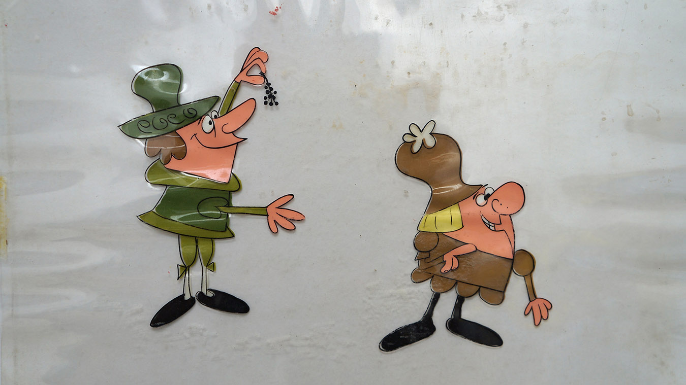
Ever bought an original Rocky or Bullwinkle drawing or cel? Chances are good that what you bought might not be what you thought it was. If you've read my book, The Art of Jay Ward, you know that art from the original series, either Rocky and His Friends or The Bullwinkle Show is exceedingly rare, mostly because they were both produced in Mexico City and very little of that art emigrated back to the States. Below is a very rare example of Rocky & Bullwinkle art produced in Mexico, recently offered at auction by Heritage Auctions:
More likely, that cel or drawing you bought was from a TV commercial, either produced contemporaneously with the original series or something more recent. Below is an example from eBay of a cel from a vintage early 1960s Cheerios commercial signed by director Bill Hurtz, writer/storyboard artist Chris Jenkyns and the late June Foray, voice of Rocky the Flying Squirrel. Should you wish to purchase this cel, you can buy it here.
For some time now, more recent drawings and cels of both Rocky and Bullwinkle
have been offered for sale and are often misleadingly labeled so that buyers might believe they were buying
vintage art; kudos to those dealers who have accurately described what they were selling. The art in question likely came from a 1986 commercial for Hershey's Kisses. The commercial can be viewed below:
Almost looks vintage, doesn't it? If the print were faded, one might almost mistake it for an early 1960s ad. However, it was produced in 1986 at Filmfair, a highly regarded Los Angeles commercial studio, because Jay Ward had stopped producing commercials in-house in 1984. The spot was notable for several reasons, not the least of which was it was Bill Scott's last performance as Bullwinkle. Building on that foundation, it was laid out and directed by Sam Cornell, a Jay Ward alum from the George of the Jungle series. (You can read more about Sam on pages 277 and 305 in The Art of Jay Ward.) Here, for sale on eBay, is one of Sam's layout drawings from the commercial:
Adding to the spot's luster, it was animated by Chris Buck who had left Disney a couple of years earlier after a 6 year run. Chris was working freelance for Sam Cornell and Filmfair on commercials during the mid-80s and later returned to Disney several times, serving as a key animator on many of the 80s and 90s hand drawn features and later as co-director of both Tarzan and Disney's mega-hit Frozen. In between stints at Disney, he directed the TV series, Family Dog and later directed the Sony feature, Surf's Up!
The character models in the Hershey commercial are spot on and, adding to the vintage look, the cels were hand inked. The image below was slated to be included in The Art of Jay Ward Productions but unfortunately it could not be located before the book went to press. If you bought art from the above commercial, it might not be vintage but it still has a strong pedigree!
Color thumbnail from the very first Rocky & Bullwinkle episode
The central thesis for my book, The Art of Jay Ward Productions, was that there was a wide gulf between what we saw on the screen and what the artists actually created for production. In some cases, that difference was due to execution, i.e. how the work was drawn or animated for production; in others, it was due to transmission--the lack of fidelity from the artwork to the viewer's experience on television, usually due to the quality of the existing prints. And the existing prints, most of them decades old, are what have been transferred to DVD. Sadly, the fact is there is no money to be made by going back to the original negatives for vintage TV cartoons, so the best chance we have to view the artist's original intentions is to view the art itself.
In previous posts, Frank Hursh described what it was like to work at
Gamma; this week I'm pleased to present a few samples of his work during
that
period. The first thing Frank color keyed at the studio for others to
paint was an
early episode of Fractured Fairy Tales entitled "The Enchanted Fish."
I've included frame captures from the current DVD transfers to
illustrate the difference between what Frank painted and the images
we've been seeing for over 50 years. Certainly, some colors were altered as the backgrounds were painted but the murkiness of the current print affects the tone of the story:
Below, some more color keys from the same episode, showing an even more radical difference:
While the writing and voice work certainly carry the cartoon, imagine what a different experience the viewer would have with the vibrant art direction evident in these color keys! What other treasures might be buried on the original negatives?
This week, Frank Hursh takes up where he left off, describing what it was like to be in the thick of production on the Jay Ward shows in Mexico:
As a painter, I had
been using oil paints, but in Mexico City I met José Luis Gutiérrez, the
inventor of acrylic paints and the owner of the Politec Paint Company. The
great Mexican muralists – Siqueiros and Orozco -had been using acrylic paints
for their murals – being exposed to the elements, this was an excellent paint
because the color was fast, and it resisted water, heat, and wind damage. José Luis had told me that I could even paint
with it on glass. So, I had started to use acrylic paints in my personal
artwork, a long time before it ever got to the U.S.
Fingers Scarnose from "The Louse on 92nd St."
At Gamma, when we had
trouble importing the Cartoon Color paints, I suggested that we switch to acrylic.
Even Politec Paints were expensive at the time, so we eventually used ICI
acrylic paints, and Sherwin Williams Super Kem-Tone, which was an excellent
acrylic paint for the exterior of homes. They would mix up special batches of
colors just for us. In the long run, it
was a good option: today the Cartoon Colors have peeled off a lot of cels, but
the acrylic paint still adheres well. (In
addition to the paint, there were other art supply issues at Gamma
involving both cels and ink; for further detail, read pages 52-53 in The Art of Jay Ward Productionswhere you can also see images of the studio's exterior.) Note the proprietary color call outs in the color model cel below; American call outs identified the color followed by a number indicating the shade or tint.
Fingers' mob from "Louse on 92nd St."
Cel from the Fractured Fairy Tale, "Slow White and Rose Red"
Cel from the Bullwinkle "Mucho Loma" adventure
Publicity cel of the same vintage, painted in the US with Cartoon Color paint
As the above examples show, the latex house paint has outlasted the old Cartoon Color gouache paint in use at that same time in the US; very few American cels from that period have survived intact. Shortly thereafter, in the early 60s, Cartoon Color came out with vinyl-based cel paint which, like the latex house paint, does not crack or peel from cels.
Seated,
left to right, Sergio, unknown, Papy. Standing, middle row, Jesus
Chucho, Roberto, Guillermo Aguilar, Raul Vilchis, Tio, unknown.
Standing, back row, Mau Mau Arellano, Frank Hursh, Nacho Brambilla.
Above, Frank Hursh with his background crew
surrounded by dozens of background paintings for various Jay Ward
shows. On the table, cans of latex paint used to
paint both the backgrounds and cels. Frank has attempted to name as many people as possible although in many cases, his recall is limited to their nicknames.
Of his crew, Frank recalls:
“Mau Mau” Arrellano was a body builder, Jesús Chucho was a television actor and did some promotional advertising for TV, Guillermo Aguilar, my assistant later became a
medical doctor. Raúl Vilchis later became the only painter out
of the group (besides Frank). “Tío” (which means “Uncle”) was the oldest guy
working in the background department, and was so named because he was the uncle of someone at Gamma although I can´t remember
who. Nacho (short for
Ignacio) Brambilla was a football player and later became a director of
television programs.
The top two photos were staged by a Life magazine photographer for a proposed story on the Gamma studio which never materialized; Frank is sitting at someone else's desk and the backgrounds were pinned up around him for the photo. Below, photos of how the background department really looked at Gamma:
(L), Frank's desk as head of the department, his assistant Guillermo sat to his right, (R), reverse angle on the same room with unknown, Nacho Brambilla, Tio and Raul Vilchis
Next week, more rare production art from Frank's years at Gamma.
Frank Hursh, head of the background dept. at Gamma Productions
During the writing process on The Art of Jay Ward Productions, I put out an all points bulletin on the Internet
looking for a few artists who had either worked directly for Jay Ward in Hollywood or for Val-Mar/Gamma
Productions in Mexico, the
subcontractor for all animation production on the Jay Ward series. One of those artists was Frank Hursh, an American painter who had headed up the background department at the Mexican studio in the early 1960s, a crucial period in the history of the Ward studio.
Admittedly, my request was a long shot and I had low expectations for any kind of response. However, while the book was at the printer’s, I received a phone call from Frank’s
daughter, Holly, responding to my posting which she had just discovered while searching on the Internet.
She was calling from Mexico with her father standing right next
to her. While it was too late to include any new
information or art from Frank, it wasn’t too late for me to ask questions or to
find out that his memoirs had been published in a bilingual
book in Mexico. Later I found out that Frank had photos of the personnel and studio from it's heyday along with a few pieces of original art. It's unlikely there will be a second edition of The Art of Jay Ward Productions so I've decided to highlight Frank Hursh and his time at the Gamma studio with a multi-part blog post.
One of Frank's backgrounds from the Bumbling Brothers Circus adventure
The most obvious question for me was 'how did an American fine arts painterend up in Mexico working on Rocky and Bullwinkle?' Here, in Frank's own words, is his story:
I had come to Mexico
with two scholarships to study a Master´s Degree in Mural Painting at the
Mexico City College (now Universidad de
las Américas) and San Carlos, the art school of the National University (Universidad Nacional Autónoma de México).
I also started doing some television production and television art, and had
become a partner in a company called Telepelículas.
I had fallen in love with Mexico, so colorful and vibrant, and soon I left
school to work full time.
The population of
Mexico City was only about 3 million at that time (middle 1950´s). There was
not much traffic. There were no stoplights along Paseo de la Reforma, which was such a beautiful boulevard. There
were glorietas (roundabouts) and
there was a tacit understanding of how traffic was to flow around those. I
never saw a car accident along that street. You could walk any place in Mexico
City without ever being bothered. It was such a lovely city– everybody seemed
to know each other. We did a lot of partying, getting together often to have a
drink and some tacos, going to Xochimilco for a ride on the chinampas (flat boats) and lots of
mariachi music. We had a good time.
I had met Bud
Gourley before, the Operating Administrator in the animation studio (Val-Mar)
at that time, and I told him that I was looking for a job. He asked me if
I had had any experience in animation, which I hadn't, so I didn't get the
job. Sometime later, after my wife and I had separated, I rented my house
to Harvey Siegel (a veteran of the NY animation industry sent to assist with
production), who invited me over to a get-together that he was having with some
people from the (Ward) studio in the States. I had painted a picture of a
train for my children´s bedroom, and Bill Hurtz (one of Ward's directors)
saw it. He said to me “Frank, I don´t have anybody down here to do color. Can
you come and give us a hand?” So that´s how I got into animation.
The painting that got Frank Hursh his first job as an animation background painter.
At Gamma, there were
250 – 300 people working at any one time. I had from 8 to 12 people, depending,
in my Department.Guillermo Aguilar was
my assistant.All in all, we did some 18
and a half minutes of limited animation a week. At 12 images per second, that’s
about 13,320 images produced in a week! That means layout, backgrounds, inking
and painting, photographing! We did quite a lot of work, very quickly.
Some of Frank's BG crew: L to R, Nacho Brambilla, Tio, unknown, Mau Mau Arellano, Sergio, Raul Vilchis, Faufis
Sometimes, we did get
some crazy things out of layout that changed the style of the backgrounds [that
had already been done] for the whole show—and we would be so busy trying to
match things up for the animation. One time we got a layout that was completely
different from all the others and we had no time to change it. It was a bit
crazy. Sometimes, because of rushing around, things were not done in the same
style, which was visibly noticeable when it was aired. It gave the show a
quirky feel, a bit off the wall. I think that was one of the things, along with the dialogue, that helped the appeal of Rocky & Bullwinkle.
Next week, more rare photos and art, along with part 2 of Frank's life at the Gamma studio in Mexico City.